This rather wonderful ‘take–off’ of Degas’ The Absinthe Drinker, appeared in the Pseuds Corner section of the current edition of Private Eye — as illustration to a piece from The London Evening Standard about a couple who, having taken on a tracker mortgage, have ‘already given up nice little treats like vine tomatoes, freshly squeezed orange juice and Parma ham. We’ve stretched ourselves, all our savings have gone into this and if rates go up more than two per cent we’ll find it difficult. It will mean only going out to dinner once a week instead of two or three times. ‘My dear!’

Well, thinking about this painting — which I have always liked — led me on to think about other portrayals of boredom, lassitude, and ennui in painting. Perhaps the most famous is Sickert’s Ennui, c1913 — a painting which I find almost unbearably depressing: Camden Town (I would imagine) on a Sunday in what was still essentially the Edwardian era. Where, oh where, is Homer’s wine dark sea and the isle of Ithaca?!

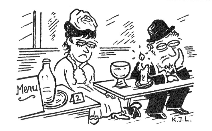
However — to return to Degas’ The Absinthe Drinker — I realise that I have never quite been sure if the portrayal is of a couple. The man appears to be altogether a rougher type than the woman — who at least seems to have made some effort with her appearance. However, if they were not a couple, would the woman not be sitting at another table? It is also very obvious that if they do have some sort of relationship, each nevertheless seems to be isolated — as if there were an invisible partition between them. The woman is sad, resigned to her lot, perhaps thinking on what might have been; the man seems beyond caring — or at least to have assumed the persona of a person contemptuous of the world (and Sartre would have said that he had chosen so to be). Certainly, we get the impression that the woman would have been susceptible to a kindly word. However, who would think of attempting a conversation with the man? He defies you to do so. From the point of view of the composition, it is interesting that the details on the foreground table — even including Degas’ signature — are essential to the painting. Including the diagonal shape (newspaper?) which straddles the two foreground tables, and in so doing echoes the short sides of all three tables, while simultaneously preventing a perspectival ‘exit’ which would lead the eye out of the left side of the picture. The Absinthe is almost undoubtedly painted in emerald green, which at that time consisted of copper aceto–arsenite, a dangerous poison, and therefore a very suitable colour for Absinthe!
Next week: Edward Hopper’s Summer Interior, 1909.


1 comment:
Your post inspired me. Thank you. I needed it.
Post a Comment